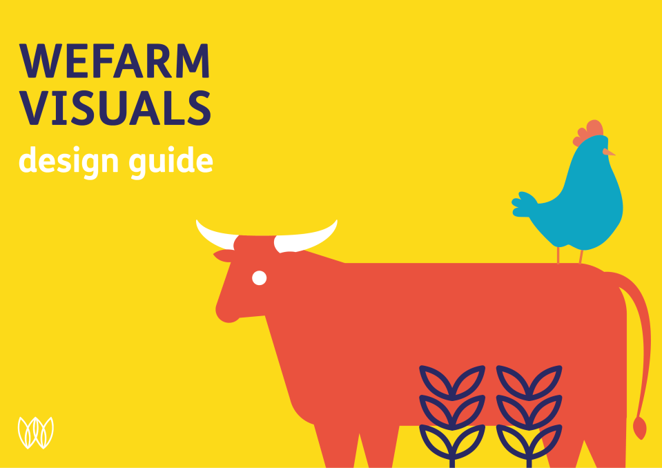
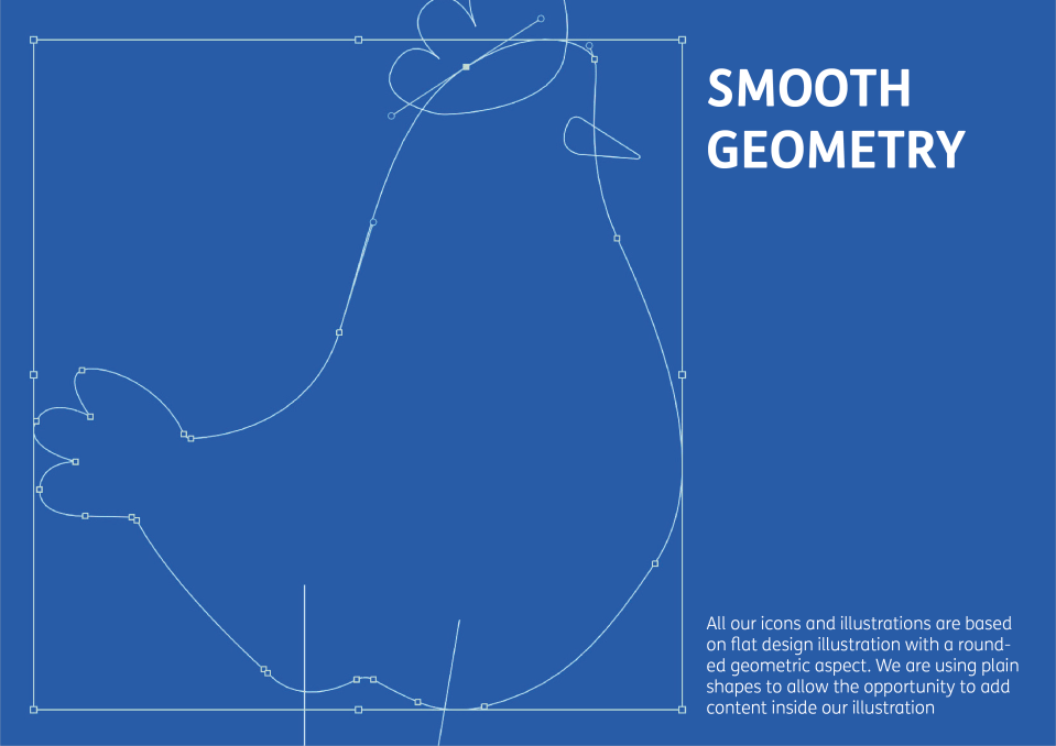
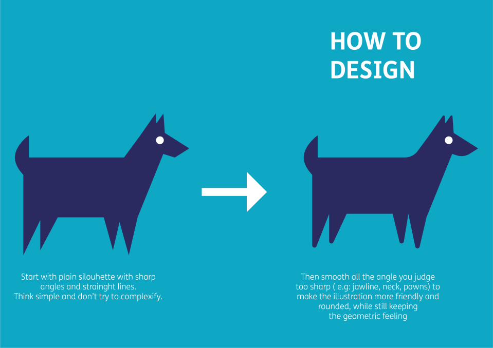
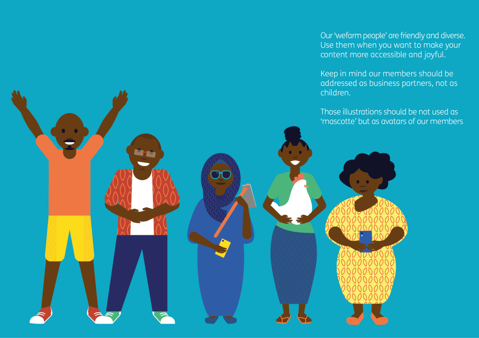
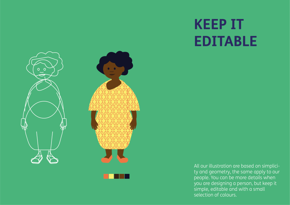
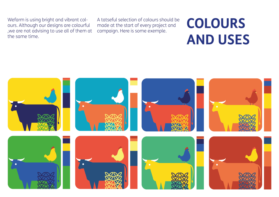
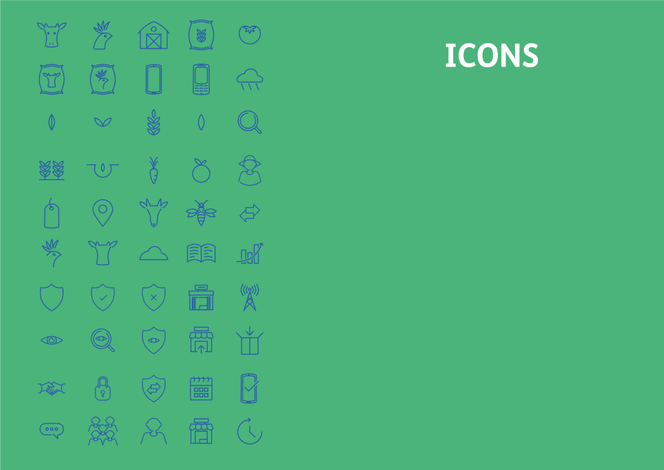
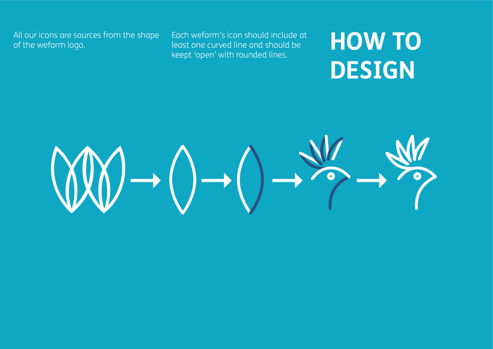
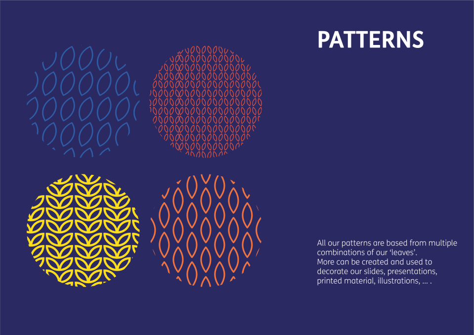
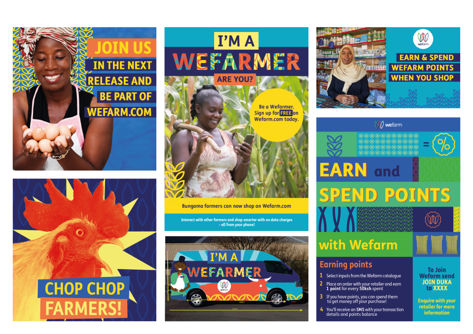
Based on Wefarm brand guidelines, I developed the company visual language by using its vibrant colours and smooth geometric shapes.
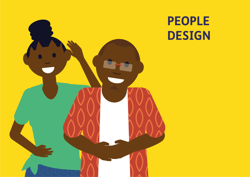
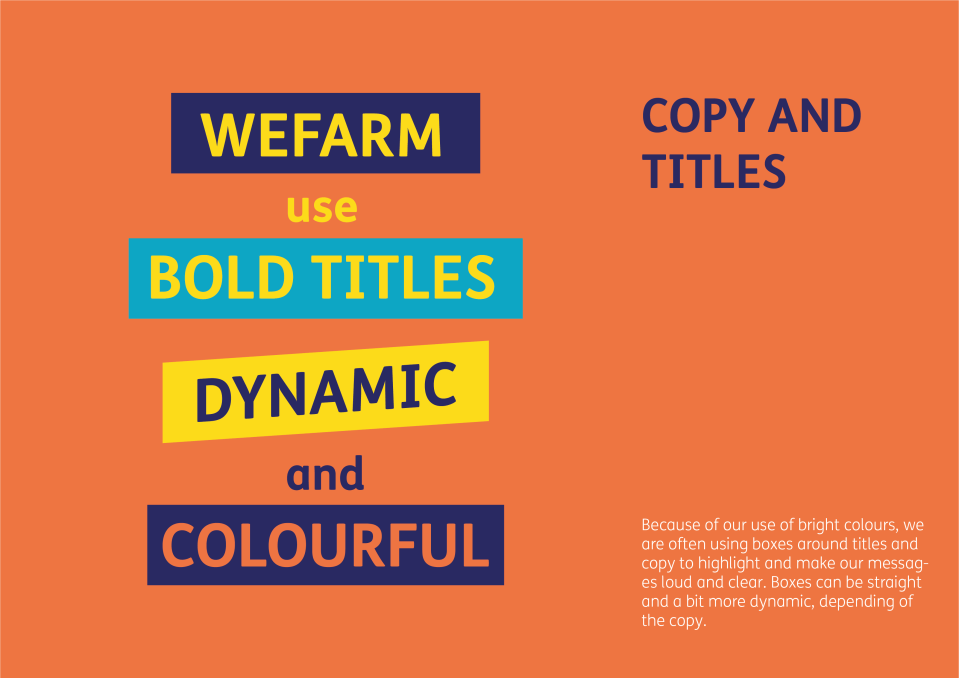
To improve user experience, I designed the company images and illustration to be playful, bright, friendly and easy to read on the app.